My Personal Investigation |
I started thinking of what I could focus my personal investigation on, and I narrowed it down to a topic which i think is the most fascinating to talk about: Colour. I'd like to focus my investigation on colour, and how it affects the way we see photos and how they turn out. Colour has always been one of the aspects of photography that draw me to a photo, and I would like to be able to create photographs that at first glance the first thing that one would notice is the colour and how it is represented. I love looking at photographs where the colours in it are highly saturated and the main focal point overall.
Initial ideas |
These are my first experiments looking at colour. As this was the first time going out and taking photographs for my personal investigation, I didn't really have a specific plan. My main focus for today was to take photos of anything that caught my eye, and anything I thought would fit into my personal investigation. I didn't really have a specific plan apart from the obvious taking photographs. I walked around for about 40 minutes and these were the photos I took:


I visited Peckham, looking for colour, graffiti etc. This was my second time in Peckham, and I remember from the first time that when leaving the train station everything was quite colourful. The graffiti on the walls were all very vibrant and really stood out. I went back to see if there was anything interesting that I could photograph. I was looking at colour, specifically colours that complimented each other in the same frame. I found it interesting that when i included more than two colours that complimented each other, the photo instantly became far more interesting to look at.
I am at a long distance from the main focus point in these photos, as i wanted to get as much of the view in the frame as possible. I was exploring colour and composition, and after looking at each photo individually, I can see that the framing could've been different and vastly improved the photo. For example, if I was to retake the last photo of the lion, I would place the camera at a higher angle so that the lens is face to face with the lion. I think the first 4 photos are the most successful because the colourful buildings and graffiti are clearly the main focus of the photo, but not overpowering enough to completely ignore the rest of what's in the frame.The next time I go out I want to focus more on the framing and colour.
I am at a long distance from the main focus point in these photos, as i wanted to get as much of the view in the frame as possible. I was exploring colour and composition, and after looking at each photo individually, I can see that the framing could've been different and vastly improved the photo. For example, if I was to retake the last photo of the lion, I would place the camera at a higher angle so that the lens is face to face with the lion. I think the first 4 photos are the most successful because the colourful buildings and graffiti are clearly the main focus of the photo, but not overpowering enough to completely ignore the rest of what's in the frame.The next time I go out I want to focus more on the framing and colour.
Saatchi Gallery and the V&A |
These are a set of photographs that I took throughout the day when we went to the Saatchi Gallery and the Victoria and Albert Museum. We started the day at school and made our way to central London where we visited two exhibitions. I quite enjoyed visiting these galleries as I like to see the different styles of photography each photographer has. The photos I took this day were mostly of the gallery, and some were taken on the walk to and from the gallery. However looking back now, I wish I had taken more photographs that related to my personal investigation. I think instead of focusing on colour I focused more on framing.


|
|


|
|


Close ups |
Today I tried doing something that for some reason, I don't usually do. When I take photographs I often stand at a distance from the subject that i'm photographing, so today I got very close to take the photos. Seeing as I am focusing specifically on colour, in the future i will be appying these close up shots to my colour photographs as well. I find it interesting when the photograph is extremely close up, as we don't really know what the subject is, giving us a chance to really analyse the photo.


I took the photographs above as after looking at the previous photograph looked like I was too far away from the subject so I decided to go closer to the subject. I thought that it would help me get closer to the subjects which I am photographing. I prefer these more than the ones taken at more of a distance as more detail is visible in each photograph. I think that this will help me on the next part of my project.
Sardegna |
|
This summer I went abroad to an Island in Italy - Sardinia.
|
It made me think more about my investigation. As i took these photos I realised that I was paying much more attention to smaller details than I would here, maybe because its not somewhere I see everyday so I feel more interested and in touch with my surroundings.


Whilst on this trip, I was constantly looking around, noticing how different my surroundings were to the ones in the UK, and I found myself wanting to take as many photographs as I could. For some reason when I'm in a new place it makes me more curious and more open to seeing more


  |
  |


It made me think more about my investigation. As i took these photos I realised that I was paying much more attention to smaller details than I would here, maybe because its not somewhere I see everyday so I feel more interested and in touch with my surroundings.


For me, taking photographs In Italy, and taking photographs in the UK feel completely different to one another. I feel much more inclined to take photographs when i'm abroad, which is one of the many reasons i enjoy travelling.


Experimentation.1 |
After taking these photographs, I was curious to see what would happen if I layered two images on top of each other. I went onto photoshop and experimented with two images that look nothing alike and these were the results:


Experimentation.2 |


National Portrait Gallery |


Diptychs + Triptych |
Today I started experimenting with diptychs and triptychs. This was my first time exploring diptychs and triptychs and I really enjoyed the process of making them and how they turned out. When i was picking and choosing which photographs looked best with one another , I focused on the colour specifically. Looking through the results now, I can see that I paired a lot of blue and brown together, which makes a lot of sense seeing as blue and brown are complimentary colours , creating quite a harmonious colour scheme. This can also make the photo appear balanced. The use of putting these two colours together is to enhance the perception of texture and tone in a photo. The earthy tones of brown bring out textures and details, whereas the cool tones of blue bring out depth and dimension.


Diptych
After looking through all my diptychs , I believe this one is the most successful . The placement and distribution of brown and blue elements to create a harmonious visual composition.

These photographs appear very different at first sight, but what made me want to unite these two photos together is the subtle colour similarity between them.
Triptych |


Painting With Light |
|
|


|
|


Zines |

Greenwhich
|
Today I went on a walk through Greenwhich with my camera.I took the photographs on my Lumix DMC-G5. I started at the main entrance of the park and slowly made my way through the park. It was a sunny day, the leaves were just starting to turn and it had just stopped raining, so the colours looked particularly lively.


Experimentation with Lightroom |
|
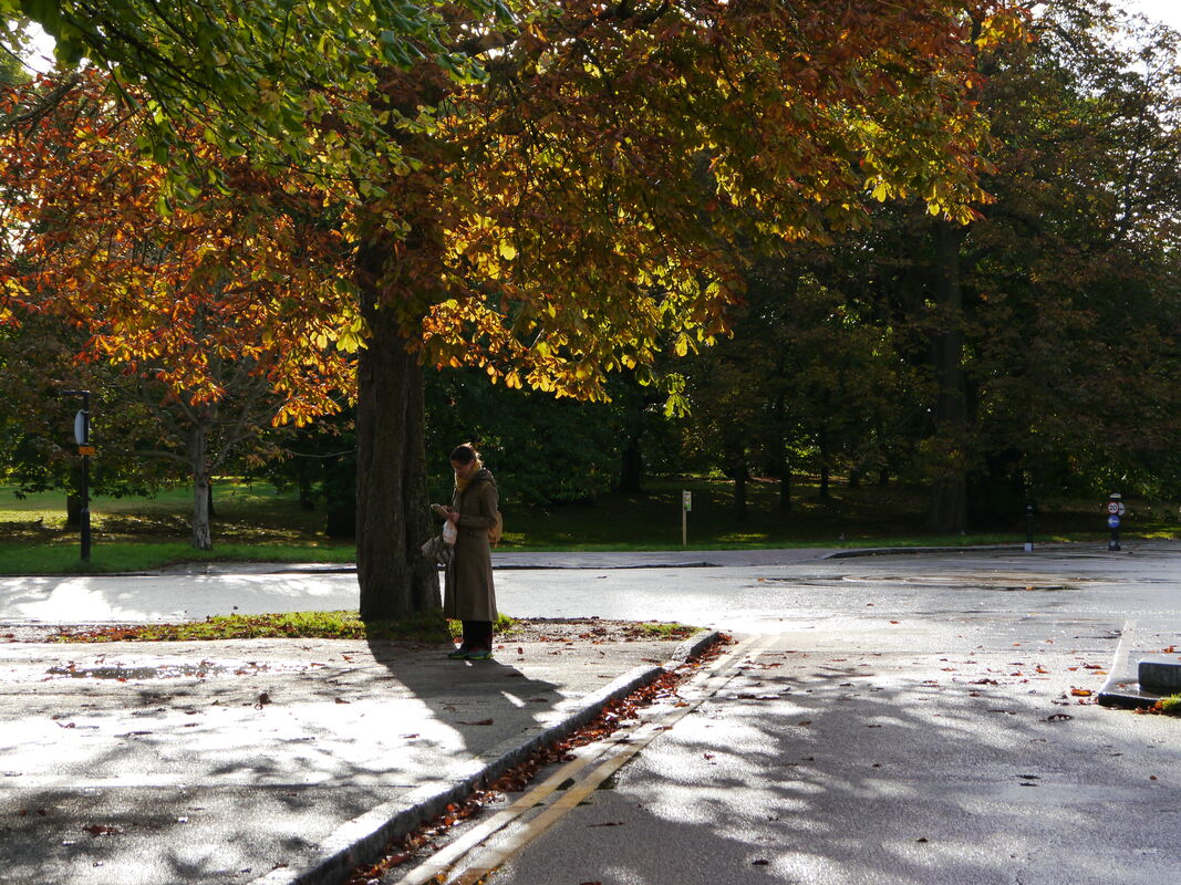
Today I went on a walk with one specific intention in mind, which was that I was going to focus on lighting and colour. I also wanted to edit my photos on light room during the editing process to see how i could bring out the colours more to compliment the surroundings. The photograph to the left is the original photo I took. Already the colours on the tree and the leaves are quite vibrant, however I had a vision of them really standing out, and the shadows being more dominant in the photo. What made me want to take the photo is the woman standing underneath the tree, as she was wearing neutral tones and it went nicely with the autumn atmosphere. I began by opening Lightroom and experimenting with different lighting settings. I changed different settings such as the saturation, exposure, shadows, etc. I find the editing part of photography to be the most interesting, as it gives me a chance to refine my photographs and make them my ideal picture.
|


Close Ups |
Taking photos close up to the subject is something i've been working towards as I often find myself taking them from further away. Something that I find quite interesting is that anybody can take a photo from far away of one specific thing and they will more or less look the same, or at least similar. However , taking photos from up close makes the photo feel more personal and detailed.
inRow 3, photo 2
inRow 3, photo 2


plan:
Week 1- Take more photographs of solid colour. Write another paragraph of my Essay.
Week 2- Write a page of my Essay. Create a zine/ exhibition. Take more photos.
Week 3- Write more of my Essay. Take more photos. Make potential title list.
Week 4- Make adjustments to my website, make the layout nicer.
Week 5- Film short clips to create a film. Write Essay.
perception of colour
derek jarman - blue ( film)
yves klein blue
david batchelor chromophobia
susan hiller colour auras
ancient egyptian colour theory
lapis lazuli renaissance painting
colour wheel
ridley road market
Diptychs |
  |
|
|

Yves Klein - Blue

|
Yves Klein was a widely influential French artist who explored the world of colour. Although Klein wasn't necessarily a photographer , his work had significant influence in photography, specifically in relations to colour and colour theory. Photographers began to explore colour as more than just a part of the scenery, but rather it being the main subject of the photo. This colour also encouraged photographers to understand emotional significance in photos, in particular Yves Klein 'Blue' and how it evokes a sense of infinity.
|
Making a book
Today I went through my photos and picked out fourteen of them that I was going to put in a book. I had never made a book before so this was more of a first time experiment to see the different ways I could display my images. I began by printing out the images first. The first time I printed them I printed them on A4 sheets of paper and they took up half the page. Once they were all printed and I had them next to each other I realised I wasn't too pleased with the results, so instead of printing them to half of an A4 size, I manually typed in the size I wanted, so that it would take up just under 1 quarter of the page.
I think that with the photograph being that size on the page makes the book more interesting to look through instead of it taking up the entire page. The use of having the photographs occupy a small portion of the page while the rest remains white , creates a visually striking and engaging photography book which is what i wanted to achieve. By giving each photograph its own space, it gives the viewer to really focus on one image at the time, whilst still being able to look at the bordering page and seeing them together. With this book and the way I ordered the photos, I placed them in a way that I felt the colours went well next to each other on the page. The white around the photos also spaces the photographs out, encouraging the viewer to really play close attention to the details and composition in each photo.


Daido Moriyama


Digital photoshoot |
My plan is to carry out 4 different photoshoots revolving around colour - two film , two digital. Today I had my first digital photoshoot and decided to go to Peckham as it's markets and walls have interesting photo opportunities and the graffiti is also interesting too.


Tate Modern |
I went to an exhibition at the Tate Modern exploring colour and how artists use colour in their photographs. I saw a variety of artists such as Yves Klein and Joel Meyerowitz who


Film photoshoot |


Making Day |
Today I had a making day, which is where we had entire day dedicated to photography and developing our personal investigation. Before the lesson I had a plan of what I was going to achieve today. For the first two hours I dedicated my time to continuing my essay and adding to my website. I wrote some more and researched further on some sections that I felt I could add more to. I then went through my personal investigation page and selected around 12 photographs that I was going to experiment with. I booked out the studio for the next 2-3 hours so i could experiment in there. When i went in the first thing I did was set up the lights using the gels to give the lights a colourful tint. At this point my idea was to have the photographs displayed on the wall with the lights giving them different tints. I organised them in numerous different ways to see which compositions looked better than others. I cut some photos into different shapes also just so that they didn't all look the same and gave my exhibition some depth. Once i had hung up the photos , i photographed them in different angles, and changed some of the compositions too.
Looking through these photographs now, I realise that I am not too impressed with how they have turned out. I really like the way the lighting turned out and would definitely experiment with colour lighting again, however next time I think I will go with a different approach instead. I think that this would have turned out more successfully if I had framed the photographs and had been more organised. Or perhaps printed it on different paper.
Looking through these photographs now, I realise that I am not too impressed with how they have turned out. I really like the way the lighting turned out and would definitely experiment with colour lighting again, however next time I think I will go with a different approach instead. I think that this would have turned out more successfully if I had framed the photographs and had been more organised. Or perhaps printed it on different paper.


chosen photos |
It is getting closer to the submission date, so I thought it would be a good idea to select 24 photographs that I could experiment with. I will then narrow these photos down to around 8-10 photos so that I can create a few diptychs.


Diptychs |


